BLOG

2024年09月08日
-
-
【レイアウト】Fの法則・Zの法則・Iの法則 2024年度版


レイアウトと視線誘導:Fの法則、Zの法則、Iの法則を理解する
Webサイトや紙媒体のデザインにおいて、ユーザーの視線の動きを理解し、効果的に情報を伝えることは非常に重要です。視線誘導の法則として知られる「Fの法則」「Zの法則」「Iの法則」は、それぞれの媒体におけるユーザーの視線の動き方を示しており、レイアウト設計の際に役立つ指針となります。
Fの法則:Webサイトにおける視線誘導
Fの法則は、Webサイトを閲覧するユーザーの視線がアルファベットの「F」を描くように動く傾向があることを示しています。具体的には、以下の順序で視線が動きます。
- 上部の横方向の動き: まず、ユーザーはページ上部を左から右へ水平に視線を動かします。ここには、サイトのロゴ、ナビゲーションメニュー、主要な見出しなどが配置されることが多く、ユーザーはこれらの情報を素早く把握しようとします。
- 左側の縦方向の動き: 次に、ユーザーはページ左端を上から下に視線を動かします。ここには、各セクションの見出しや重要なキーワードなどが配置されることが多く、ユーザーは興味のある情報を探し出そうとします。
- 下部の横方向の動き: 最後に、ユーザーはページ下部を左から右へ水平に視線を動かします。ここには、フッター情報や著作権表示などが配置されることが多く、ユーザーはこれらの情報を必要に応じて確認します。
Fの法則をレイアウト設計に活かすためには、以下のポイントを意識することが重要です。
- 重要な情報は左上に配置する: ユーザーの視線が最初に触れる左上部分に、サイトのロゴ、キャッチコピー、主要なコールトゥアクションなどを配置することで、ユーザーの注意を引きつけ、サイトの目的を明確に伝えましょう。
- 見出しやキーワードを左側に配置する: 各セクションの見出しや重要なキーワードを左側に配置することで、ユーザーが情報を効率的に探し出せるようにしましょう。
- 視線の流れを意識したデザインにする: ユーザーの視線が自然に流れるように、コンテンツの配置や余白の取り方を工夫しましょう。
Zの法則:紙媒体における視線誘導
Zの法則は、チラシやポスターなどの紙媒体を閲覧するユーザーの視線がアルファベットの「Z」を描くように動く傾向があることを示しています。具体的には、以下の順序で視線が動きます。
- 左上から右上への動き: まず、ユーザーは左上から右上へ視線を動かします。ここには、キャッチコピーやメインビジュアルなどが配置されることが多く、ユーザーの注意を引きつけ、興味関心を高める役割を果たします。
- 右上から左下への動き: 次に、ユーザーは右上から左下へ視線を動かします。ここには、商品の説明やサービスの特徴などが配置されることが多く、ユーザーはこれらの情報を理解しようとします。
- 左下から右下への動き: 最後に、ユーザーは左下から右下へ視線を動かします。ここには、連絡先やコールトゥアクションなどが配置されることが多く、ユーザーに行動を促す役割を果たします。
Zの法則をレイアウト設計に活かすためには、以下のポイントを意識することが重要です。
- 左上に重要な情報を配置する: ユーザーの視線が最初に触れる左上部分に、最も伝えたい情報を配置しましょう。
- Zの動線上に情報を配置する: Zの動線上に、伝えたい情報を順序立てて配置することで、ユーザーが情報をスムーズに理解できるようにしましょう。
- 右下にコールトゥアクションを配置する: ユーザーに行動を促すコールトゥアクションは、視線の最後に触れる右下に配置しましょう。
Iの法則:スマートフォンにおける視線誘導
Iの法則は、スマートフォンを閲覧するユーザーの視線が上から下に垂直に動く傾向があることを示しています。これは、スマートフォンの画面が縦長であること、スクロール操作が上から下への動きであることなどが影響しています。
Iの法則をレイアウト設計に活かすためには、以下のポイントを意識することが重要です。
- 重要な情報を上部に配置する: ユーザーの視線が最初に触れる上部部分に、最も伝えたい情報を配置しましょう。
- 情報を縦方向に整理する: コンテンツを縦方向に整理し、スクロール操作に合わせて情報を段階的に表示することで、ユーザーが情報を理解しやすくしましょう。
- コールトゥアクションを適切な位置に配置する: コールトゥアクションは、ユーザーが情報を確認した後に自然な流れでクリックできる位置に配置しましょう。
まとめ
Fの法則、Zの法則、Iの法則は、それぞれの媒体におけるユーザーの視線の動き方を示しており、レイアウト設計の際に役立つ指針となります。これらの法則を理解し、適切に活用することで、ユーザーにとって見やすく、理解しやすいデザインを実現することができます。
ただし、これらの法則はあくまで一般的な傾向であり、常に当てはまるとは限りません。ユーザーの属性やコンテンツの内容など、状況に応じて適切なレイアウトを選択することが重要です。
また、視線誘導の法則以外にも、配色、フォント、余白の取り方など、デザインの要素は多岐にわたります。これらの要素を総合的に考慮し、ユーザー体験を向上させるデザインを目指しましょう。
最後に、Webサイトやアプリのデザインにおいては、ユーザーの行動を分析し、改善を繰り返すことが重要です。アクセス解析ツールなどを活用し、ユーザーの行動パターンを把握することで、より効果的なレイアウト設計を行うことができます。
視線誘導の法則を理解し、ユーザー中心のデザインを実践することで、Webサイトや紙媒体の効果を最大限に引き出すことができます。常にユーザーの視点を意識し、より良いデザインを目指しましょう。
Layout and Visual Guidance: Understanding the F-Pattern, Z-Pattern, and I-Pattern
Understanding how users' eyes move and effectively conveying information is crucial in web and print design. The "F-Pattern," "Z-Pattern," and "I-Pattern," known as laws of visual guidance, illustrate how users' eyes tend to move in each medium, providing valuable guidelines for layout design.
The F-Pattern: Visual Guidance on Websites
The F-Pattern suggests that users' eyes tend to move in the shape of the letter "F" when browsing websites. Specifically, their eyes move in the following order:
- Horizontal movement at the top: Users first move their eyes horizontally from left to right across the top of the page. This area often contains the site logo, navigation menu, and main headings, as users try to quickly grasp this information.
- Vertical movement on the left side: Next, users move their eyes vertically down the left side of the page. This area often contains section headings and important keywords, as users try to find information that interests them.
- Horizontal movement at the bottom: Finally, users move their eyes horizontally from left to right across the bottom of the page. This area often contains footer information and copyright notices, which users check as needed.
To utilize the F-Pattern in layout design, it's important to keep the following points in mind:
- Place important information in the top left: By placing the site logo, catchphrase, and main call-to-action in the top left area where users' eyes first land, you can attract their attention and clearly convey the site's purpose.
- Place headings and keywords on the left: Placing section headings and important keywords on the left allows users to find information efficiently.
- Design with the flow of sight in mind: Consider the placement of content and white space so that users' eyes flow naturally.
The Z-Pattern: Visual Guidance in Print Media
The Z-Pattern suggests that users' eyes tend to move in the shape of the letter "Z" when viewing print media such as flyers and posters. Specifically, their eyes move in the following order:
- Movement from top left to top right: Users first move their eyes from the top left to the top right. This area often contains the catchphrase and main visual, which attract users' attention and increase their interest.
- Movement from top right to bottom left: Next, users move their eyes from the top right to the bottom left. This area often contains product descriptions and service features, as users try to understand this information.
- Movement from bottom left to bottom right: Finally, users move their eyes from the bottom left to the bottom right. This area often contains contact information and calls-to-action, encouraging users to take action.
To utilize the Z-Pattern in layout design, it's important to keep the following points in mind:
- Place important information in the top left: Place the most important information in the top left area where users' eyes first land.
- Place information along the Z-path: By placing the information you want to convey in order along the Z-path, you can help users understand the information smoothly.
- Place the call-to-action in the bottom right: Place the call-to-action, which encourages users to take action, in the bottom right where their eyes last land.
The I-Pattern: Visual Guidance on Smartphones
The I-Pattern suggests that users' eyes tend to move vertically from top to bottom when browsing on smartphones. This is influenced by factors such as the vertical shape of smartphone screens and the top-to-bottom scrolling motion.
To utilize the I-Pattern in layout design, it's important to keep the following points in mind:
- Place important information at the top: Place the most important information at the top where users' eyes first land.
- Organize information vertically: Organize content vertically and display information gradually as users scroll, making it easier for them to understand.
- Place calls-to-action in appropriate positions: Place calls-to-action where users can naturally click on them after viewing the information.
Conclusion
The F-Pattern, Z-Pattern, and I-Pattern illustrate how users' eyes tend to move in each medium, providing valuable guidelines for layout design. By understanding and utilizing these patterns appropriately, you can create designs that are easy for users to see and understand.
However, these patterns are just general tendencies and may not always apply. It's important to choose the appropriate layout depending on the situation, such as user attributes and content.
In addition to visual guidance patterns, there are many other design elements, such as color schemes, fonts, and white space. Consider all of these elements comprehensively to aim for a design that enhances the user experience.
Finally, in website and app design, it's important to analyze user behavior and make repeated improvements. By utilizing access analysis tools and understanding user behavior patterns, you can create even more effective layout designs.
By understanding visual guidance patterns and practicing user-centered design, you can maximize the effectiveness of websites and print media. Always keep the user's perspective in mind and strive for better design.
Recommend
-

2026年05月28日
【赤色・レッド】好きな色から見える性格 2026年度版
-

2026年05月25日
【桃色・ピンク】好きな色から見える性格2026年度版
-
2026年05月22日
【白色・ホワイト】好きな色から見える性格 2026年版
-

2026年04月22日
【完全版】人間のスペックをPCに例えてみた!自分の強みを知り、社会で最大限に活かす方法
-

2026年04月15日
人間のスペックをPCパーツに例えてみた!【第三弾:ネットワーク・セキュリティ編】
-
2026年04月08日
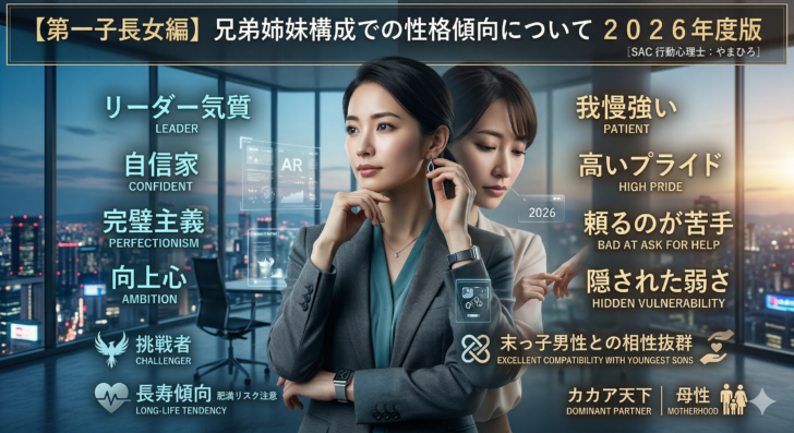
【第一子長女編】兄弟姉妹構成での性格傾向について 2026年度版
-

2026年04月08日
人間のスペックをPCパーツに例えてみた!【第二弾:ソフトウェア・アップデート編】
-
2026年04月02日
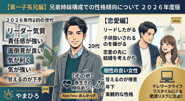
【第一子長兄編】兄弟姉妹構成での性格傾向について 2026年度版